Design Trends for 2023
what we’re seeing (and loving) in design trends this year.
1. Embrace the curves…
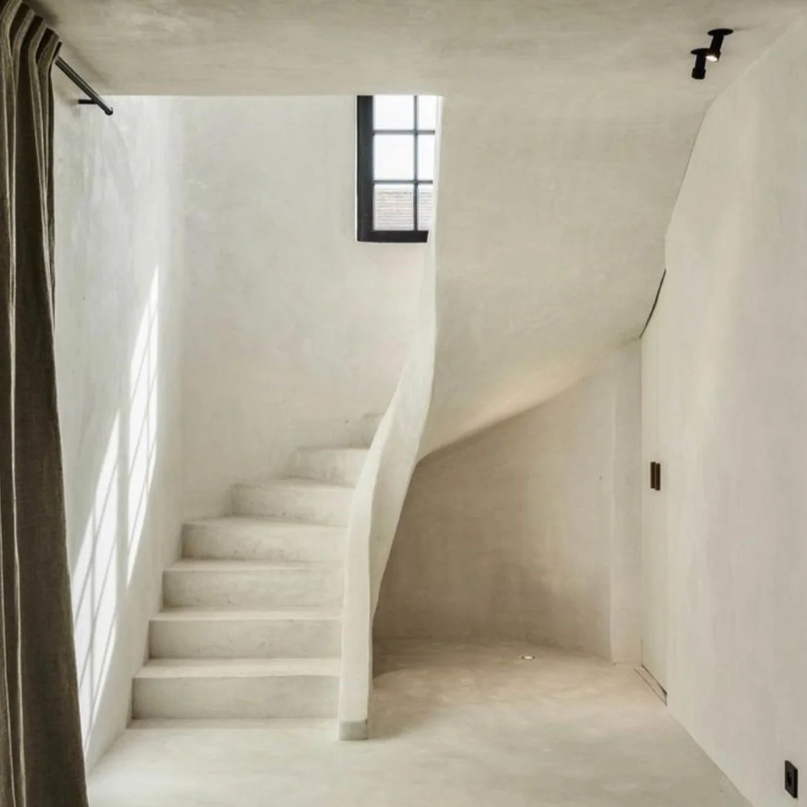
We’ve been seeing arches in doorways and windows for years but recently we’ve been loving the curves showing up elsewhere. We’re seeing a move away from linear shapes and towards organic lines and curves in unexpected places. There are a lot of trends coming from Mexican architecture and design right now and this is definitely one of them. In renovations, think about adding a curve to a stairwell, ceiling, or accent wall. If you’re trying to make a space seem a little less severe, try using sofas with curved arms, round accent chairs, or kidney shaped coffee tables.
2. Return to the dark side
After years of whitewashed, Scandinavian inspiration for wood floors and cabinetry, the darkness returns! Not the rich deep browns and auburn mahoganies of the 80s but mid-tone browns are definitely creeping their way back into flooring and cabinetry. In the Hudson Valley, it’s all about a turn towards authenticity. The original wood floors of the farmhouses past are finally getting the love they deserve. We’re seeing a focus on restoration over replacement which can sometimes mean a bigger price tag but ultimately honors the home and can be huge for ROI. For cabinetry, we’re seeing a lot of mid-century influence in kitchens. From narrow shaker doors to slats, millwork is making a comeback, and it tends to be moody.
3. Microcement…macro impact
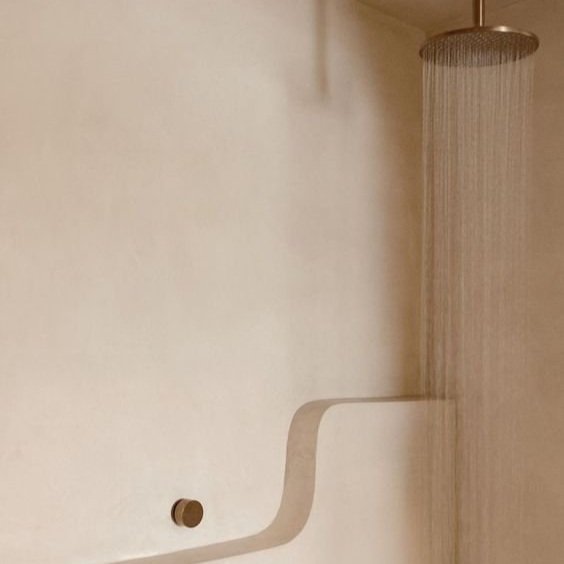
A new innovation in plaster technology has given us a bathroom wall covering other than tile, and we. are. thrilled. Microcement is a polymer modified cement that is applied in layers of varying viscosity to bathroom walls. The result is walls that appear solid concrete that actually just have a thin waterpoof coating of microcement. They are full of warmth and texture, are very easy to maintain, and you don’t have to worry about grout lines! There is a technique to applying this stuff, so your contractor might have to watch a few videos, but is totally worth it in the end.
4. The cafe (curtain) is open
Cafe curtains have swept back into our lives, a trend that we really haven’t seen since the 1950’s. This time think; French Cottage and not mustard yellow polyester. This extremey cute idea works in kitchen windows or as an alternate to cabinet doors in a kitchen island or built in storage. They look super impactful in a space that is already updated and not too traditional, so they can add a wink and a nod to vintage without appearing outdated. There are some stunningly adorable example out there, think gingham curtains and antique brass hardware.
5. Get off the island…
…and pull up a seat to the kitchen table. We’re taking a cue from European kitchens here, and saying goodbye to the overgrown islands that scream mid-aught American. This idea is based on the kitchen table as a work space, think: sitting down to shell peas, rolling out sheets of pasta and a kid doing homework all in one place. The kitchen table as island is low profile too so if you’re working with low ceilings or a cramped space, it will make it seem larger. Obviously, there is less storage so you will have to consider that before you make the leap.


